What’s the Best Font for Manuscripts?
2 October 2026 · 3 min read
Choosing the right font is an important step in preparing a professional manuscript. Whether you are writing a novel, an academic paper, a short story, or a nonfiction book, your font can affect readability and presentation.
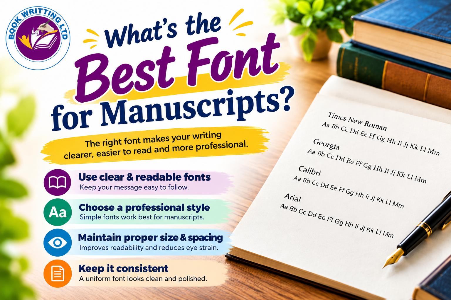
The best font for your manuscript depends on its purpose and the submission guidelines provided by your publisher, editor, or institution. Fonts such as Times New Roman, Georgia, and Arial are popular options because they offer clear, readable text.
1. Times New Roman
Times New Roman is a traditional serif font widely used in academic writing and manuscript preparation. Its familiar letterforms make it suitable for long passages of text.
Best for: Academic papers, traditional manuscripts, and formal documents.
2. Georgia
Georgia is a serif font designed for readability, particularly on screens. Its distinctive letterforms can make longer passages comfortable to read.
Best for: Digital manuscripts, drafts, and long-form writing.
3. Arial
Arial is a clean sans-serif font with a simple, modern appearance. It can be a practical option when a publisher or submission guideline requests a sans-serif typeface.
Best for: Business documents, reports, and manuscripts requiring a sans-serif font.
4. Calibri
Calibri has a contemporary, uncluttered design and is often used in everyday word-processing documents. It can work well for drafts and professional documents when permitted by the submission requirements.
Best for: Working drafts, reports, and general documents.
What Is the Best Font Size for a Manuscript?
For a standard manuscript, 12-point text is a common starting point. However, always check the requirements of your publisher, agent, editor, or academic institution before finalizing your document.
Consider these basic formatting tips:
Use a readable font size, commonly 12 points.
Maintain consistent line spacing throughout the document.
Use clear paragraph breaks and consistent margins.
Avoid decorative fonts in the main body text.
Keep headings and subheadings consistent.
Follow the required file format and submission guidelines.
Serif vs. Sans-Serif Fonts
Serif fonts, such as Times New Roman and Georgia, have small finishing strokes on some letters. Sans-serif fonts, such as Arial and Calibri, do not have these strokes.
Both styles can be readable. The right choice depends on the manuscript type, the intended reading format, and the recipient's requirements.
Common Manuscript Formatting Mistakes to Avoid
Avoid switching between multiple fonts without a clear reason. Extremely small text, inconsistent spacing, decorative typefaces, and unusual formatting can make a manuscript harder to review.
Most importantly, do not assume that one font is required for every manuscript. Different publishers and institutions may have different formatting rules.
So, what’s the best font for manuscripts? Times New Roman is a familiar traditional choice, Georgia offers readable letterforms for screen-based reading, and Arial provides a clean sans-serif alternative. Calibri can also work well for general drafts.
Ultimately, readability, consistency, and compliance with submission guidelines matter most. Choose a clear font, use consistent formatting, and check the relevant requirements before submitting your manuscript.
Need help preparing a professional manuscript? Book Writting LTD can help you explore writing, editing, and manuscript preparation services.